Project 2
The Generic License
Your First CSS Project
-
For whatever reason, license layouts always seem to look awful; not sure if it's a deliberate choice in order to make it harder to create fakes, or they just didn't want to spend the money to hire a good designer.
But on the flip side, that means we're not going to be grading too harshly on your first CSS project, since our starting point is a pretty low bar!
To the right, you'll see the generic license layout that we're aiming for. This might look a tad complex, but let's see how we can break this design down into smaller pieces that will be easier to digest (mentally).
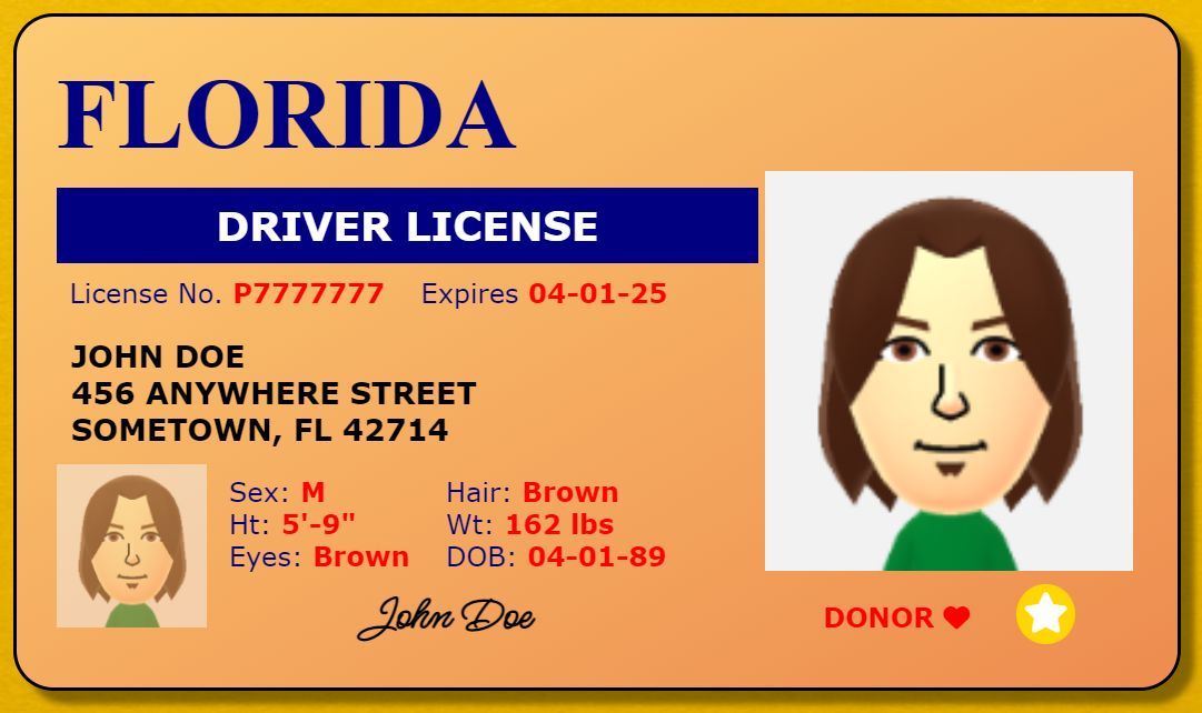
A completed version of the project -
Our approach to breaking this design down is going to be starting with the largest chunks of content, and then seeing how we can break them down into smaller chunks.
Our largest chunk is the entire license itself, represented by the large red box surrounding the whole license.
Remember, every HTML Element is ultimately just a box, which can be further broken down into the CSS Box Model components of margin, border, padding, and content.
As a result, each box that we draw in this walkthrough will represent an HTML element.
Most of the time, the large boxes grouping big chunks of content will be <div> elements.
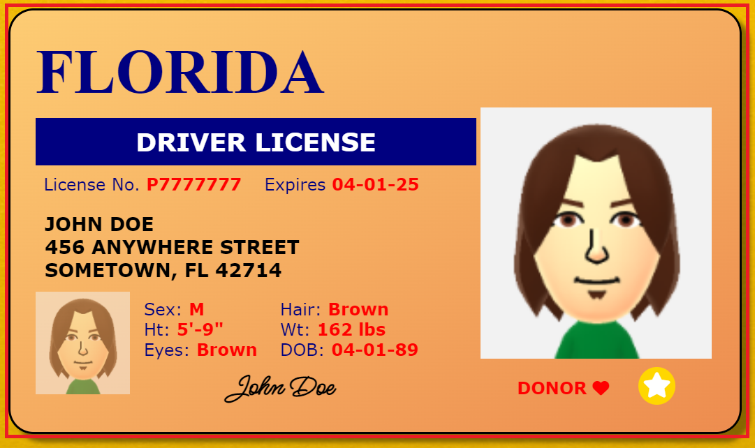
The largest (red) box, representing the largest grouping of content -
Next, we identify the smaller groupings of content inside of the large red box.
There are different ways of breaking up the content inside, but I recommend going one line at a time down the design and applying this rule:
If it's on its own line, it can get its own box.
However, if it's side-by-side with something else, then that content and whatever it's side-by-side with should have their own boxes (sometimes within a larger box for the whole line).You can see that logic applied by looking at the smaller red boxes to the right:
- The FLORIDA heading on the top is one box
- And beneath that are two side-by-side boxes
- The larger left box with all the driver info
- And the smaller right box with the larger image and REAL-ID and donor info
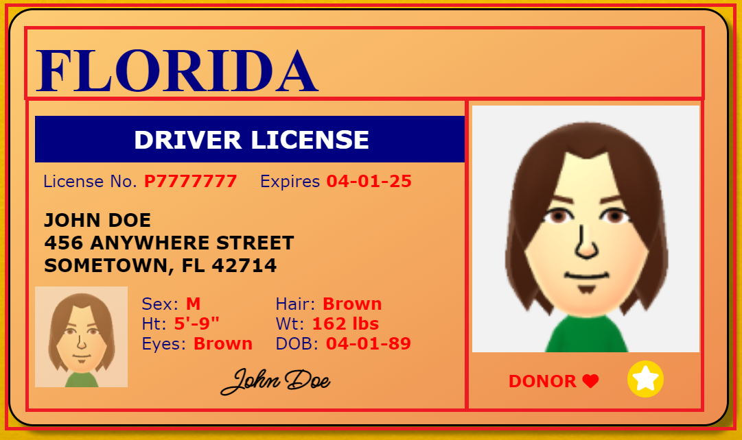
Three additional red boxes inside of the big red box,
showing how content can be grouped up in the HTML -
The top red box with FLORIDA inside can't be broken down into smaller chunks, so we'll leave that and move on to the other boxes.
Let's tackle the left box first.
- The DRIVER LICENSE text is all on its own line, so it gets its own box.
- The License No. and Expiration date are side-by-side, but are similarly styled, so we'll give them a single container box and box them separately later.
- The address is not side-by-side anything, so it can get its own box.
- The final chunk has lots of side-by-side content, so we'll put that all in one container box as well, and split them up later.
Now let's rinse and repeat for all the side-by-side content in THOSE boxes!
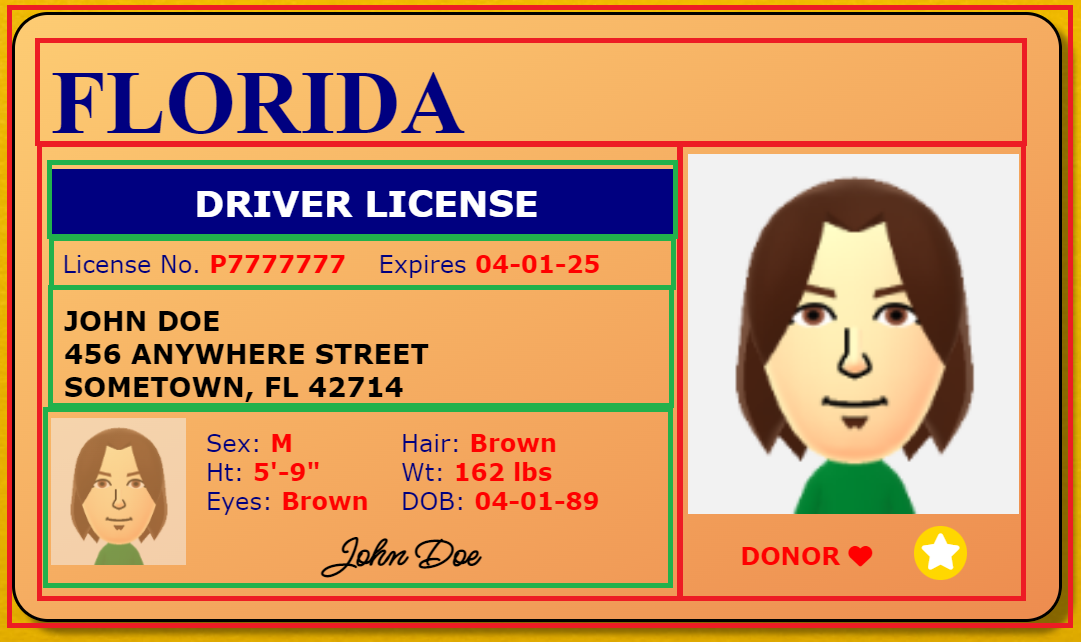
Green boxes representating additional HTML Elements inside of the left red box -
First, we have the license number and expiration date. Since those are side-by-side, they get their own boxes.
The next box with side-by-side content is the bottom green one. This one has quite a lot going on inside of it, but again, we're only going to focus on the groupings of content inside, and split them up one chunk at a time.
The image is the first chunk; that's pretty straightforward.
You might be tempted to break up the remaining content into even smaller chunks at this point, but look closely: ALL of it is side-by-side with the image.
That means that ALL of it should be put into a container box next to that image.
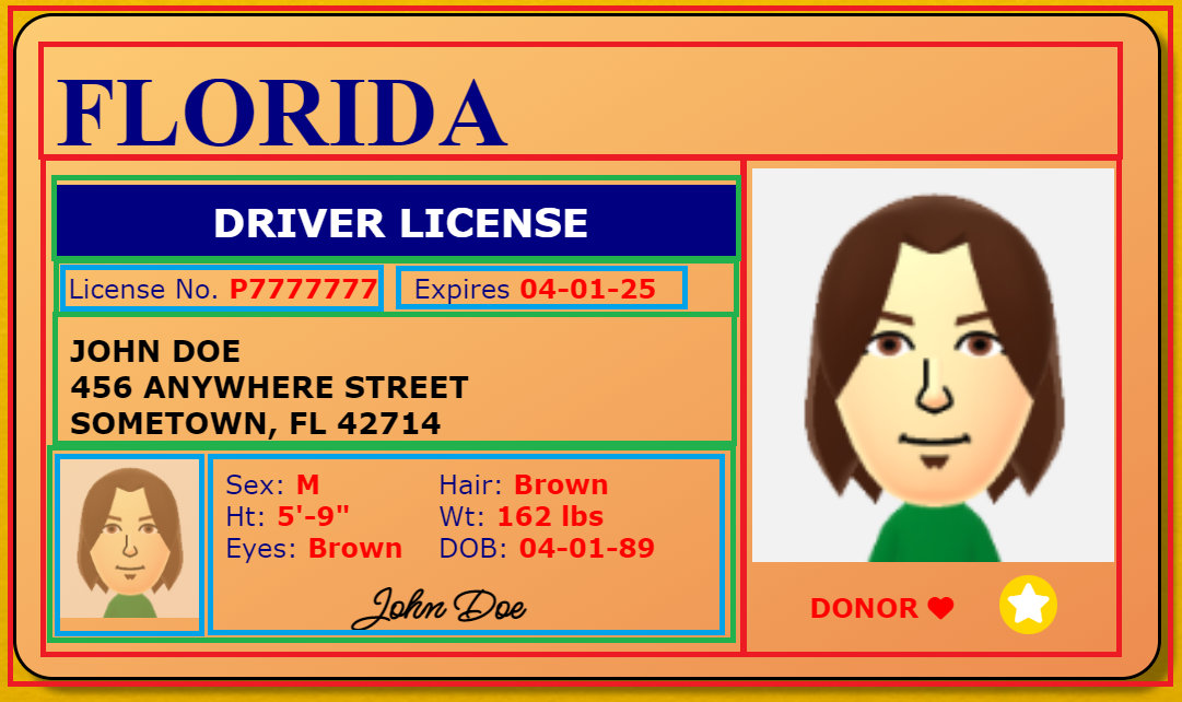
Light blue boxes representing additional content boxes inside of the green boxes -
Now we keep going, looking at how to break down the content inside of the light blue box.
At this juncture, there's another couple ways that we could split things up. We could give each line of side-by-side content its own box. Or, we could group each side of the side-by-side content into its own box.
We're going to opt for the latter, although there's no significant difference from the former.
Then, we finally have that signature at the bottom, and since it takes up its own line, it gets its own box.
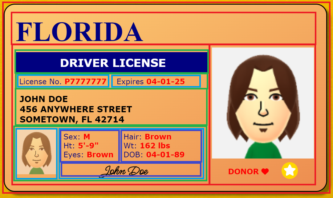
Dark blue boxes representing additional content boxes inside of the light blue boxes -
Finally, we have to break up the left and right sides of the side-by-side boxes into their own boxes.
Again, everything that has its own line inside of the box gets its own box, so basically every field of data gets its own box.
Technically, we should go even further, since each field name and value have different styles. But we've pretty much ran out of space to draw more boxes, so we'll leave that to you when you work on this!
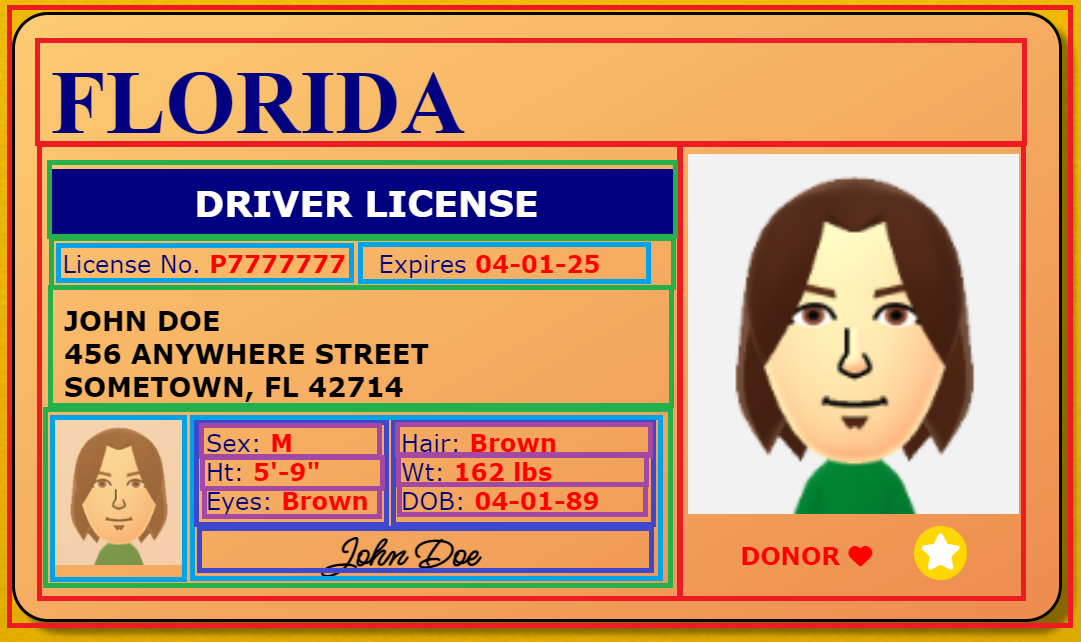
Purple boxes representing additional content boxes inside of the dark blue boxes -
However, we're not done yet! Everything we've been doing for the last few steps has only been for the left red box; we still have the right red box to break up!
Thankfully, there's less content in the right side, so it will be simpler to break up.
The image has its own line, so it gets its own box.
Then we have the line of side-by-side content for the donor and REAL-ID, so they get their own box too.

Green boxes representing additional content boxes inside of the right red box -
Then, we can give the donor and REAL-ID their own boxes as well, since they're side-by-side.
And with that, we're finally done breaking up the content into those smaller chunks.
It may look a lot messier now, but that's actually how the HTML is going to be structured. Remember, every box we've drawn represents an HTML Element container.
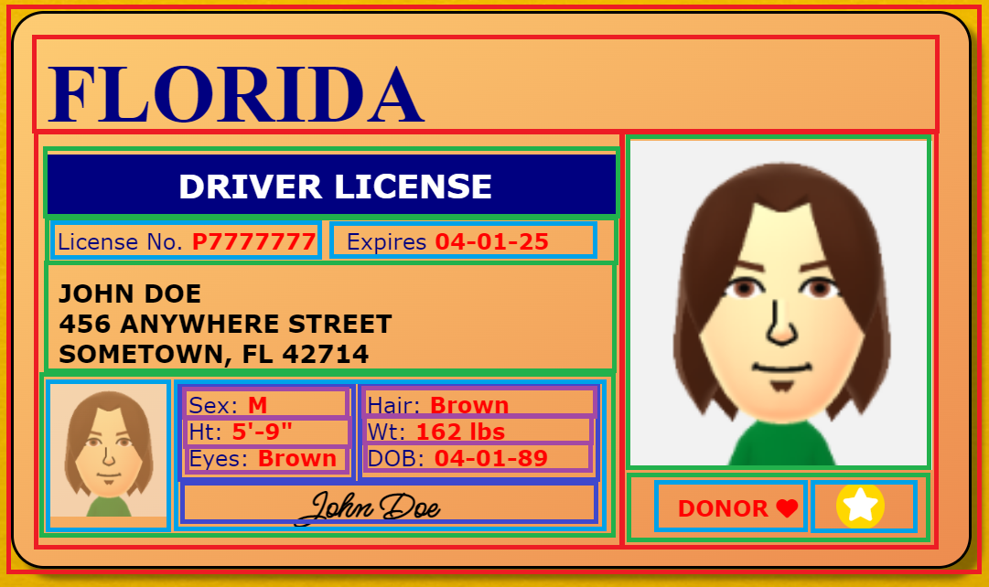
Light blue boxes representing additional content boxes inside of the bottom right green box -
Now, for this project, the HTML code is already written for you.
But that doesn't mean we went through this exercise in vain!
If you can still "see" these boxes when you look at the design, it'll be that much easier for you to "see" their matching HTML elements in the code.

The finished license, without boxes -
What's more, the template you'll get for the project has NO CSS styling written for the license. The image to the right is what you're going to see when previewing the template. Yikes!
This may look pretty intimidating, but we've already taught you the approach that will allow you to succeed:
Style the license in the same way we broke down the content boxes, starting with the outermost boxes and working your way inward, one level at a time.
Most of the time, this will be a much easier and more straightforward approach than doing it some other way.
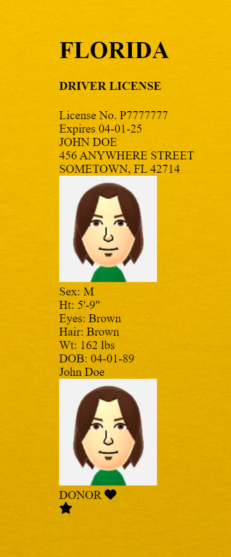
The license with no styling whatsoever -
To begin, start by defining the styles for the whole license container. (A width of 700px with a rounded border is a good starting point!)
Then set up the containers for the inner red boxes: the FLORIDA one is a pretty basic block container, but the ones representing the left and right red boxes need to be placed side-by-side, so those will probably need to be inline-blocks.
This will still look pretty messy at first; just look at the image on the right for proof. But it's a small step closer.
Then rinse and repeat for the remaining boxes: if they get an entire line on their own, use a block element; otherwise, use an element that you configure to be an inline-block to get them side-by-side.
And as you apply the styling to the boxes based on the groupings and layout we identified earlier, slowly but surely, you'll see that design from the mockups coming to life.
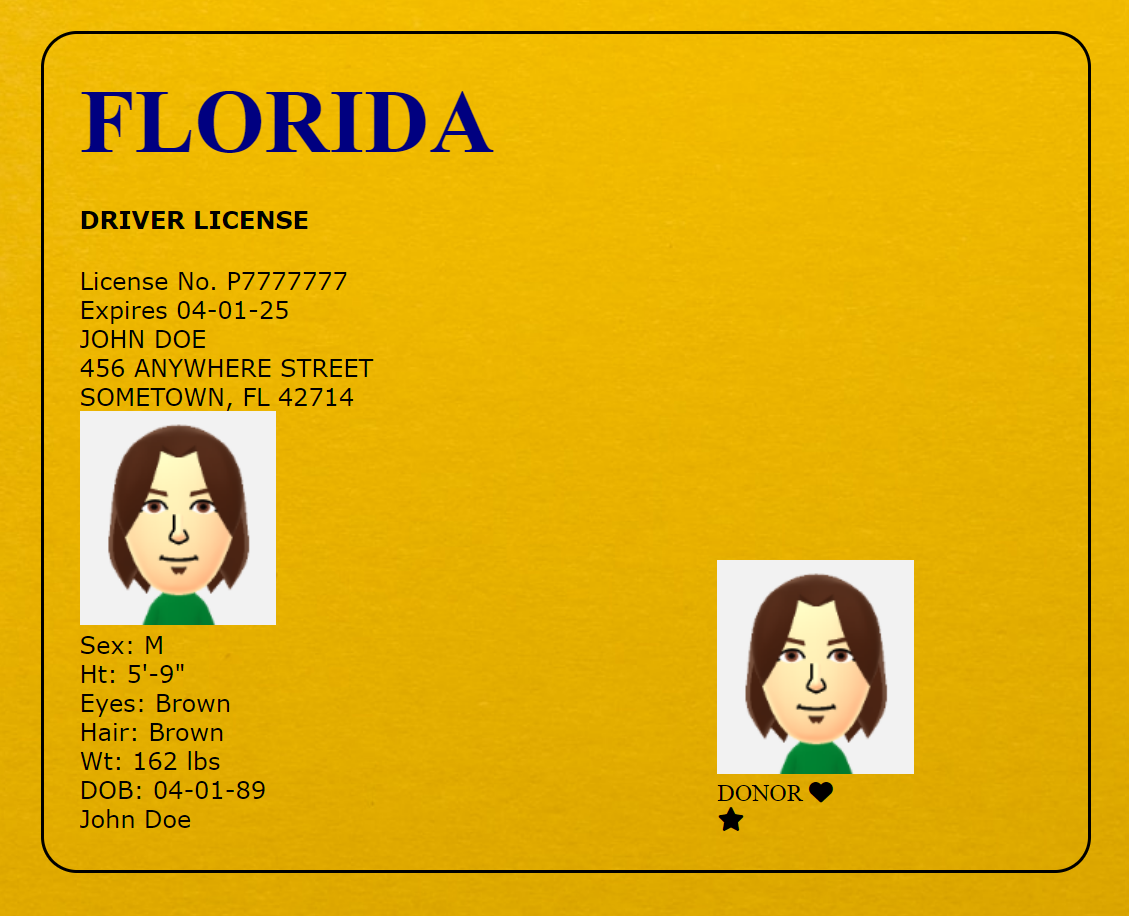
The license with only the outermost box styled,
along with the side-by-side inner content boxes